Responsive Web Design Tutorial - Build a RWD Photo Gallery Web Page
View the outcome
1. Set up html file
HTML5 introduced a method to let web designers take control over the viewport, through the <meta> tag.
You should include the following <meta> viewport element in all your web pages:
<meta name="viewport" content="width=device-width, initial-scale=1.0">
Your code should look like this or similar:

2. Title & Header
Give your page a title, then build its header:
<header>
<h1>Photo Gallery</h1>
</header>
3. Build the Columns in HTML
Creat a div with "content" class to hold our photo grid.
<div class="content">
</div>
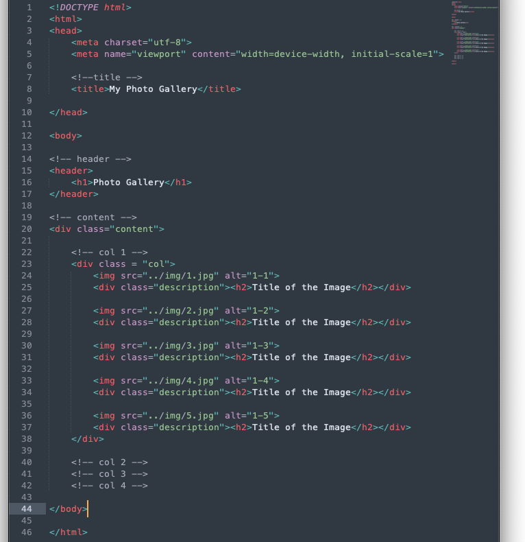
Now, build the grid for out photo gallery with the "col" class, which we will define in the css file later.
<div class = "col">
<img src="../img/1.jpg" alt="1-1">
<div class="description"><h2>Title of the Image</h2>
</div>
<img src="../img/2.jpg" alt="1-2">
<div class="description"><h2>Title of the Image</h2>
</div>
<img src="../img/3.jpg" alt="1-3">
<div class="description"><h2>Title of the Image</h2>
</div>
<img src="../img/4.jpg" alt="1-4">
<div class="description"><h2>Title of the Image</h2>
</div>
<img src="../img/5.jpg" alt="1-5">
<div class="description"><h2>Title of the Image</h2>
</div>
</div>
In my example I have four of them, but any number between 2-6 should work. Add your photos. Feel free to add the title of the image in the "description" div. Delete it if you want a grid only filled with photos.
Your code should look like this or something similar:

4. Set Up the CSS File & Typography
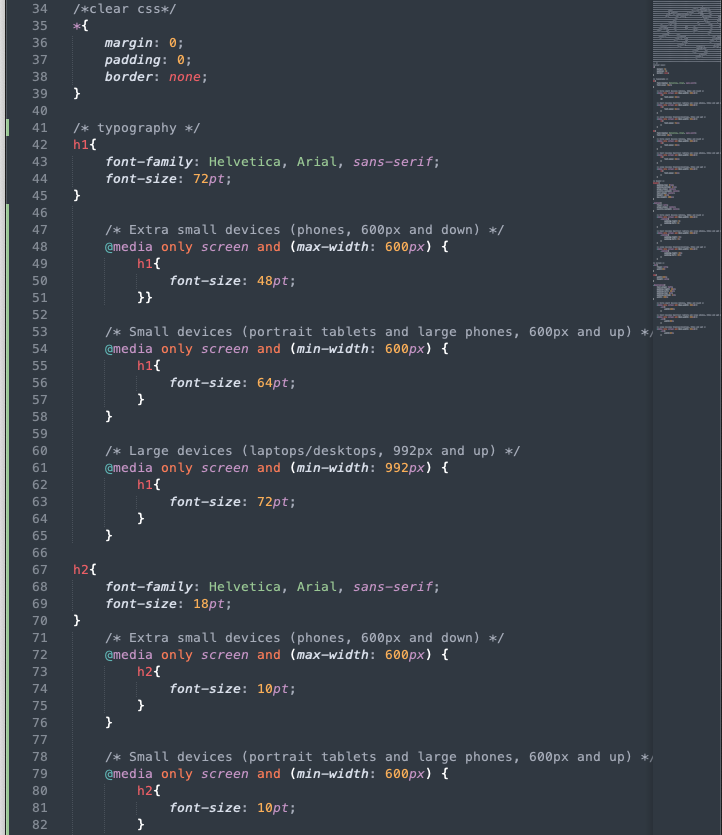
Clear the default formatting of the css file:
*{
margin: 0;
padding: 0;
border: none;
}
Set up the typography settings, feel free to change the font-family and font-size:
h1{
font-family: Helvetica, Arial, sans-serif;
font-size: 72pt;
}
h2{
font-family: Helvetica, Arial, sans-serif;
font-size: 18pt;
}
5.Set up the Content
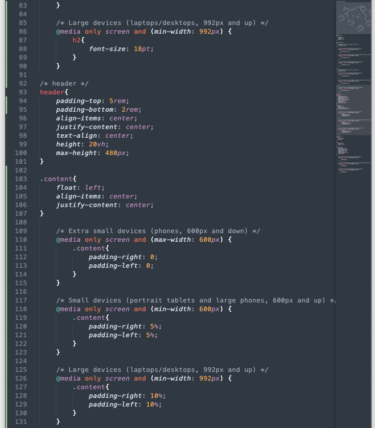
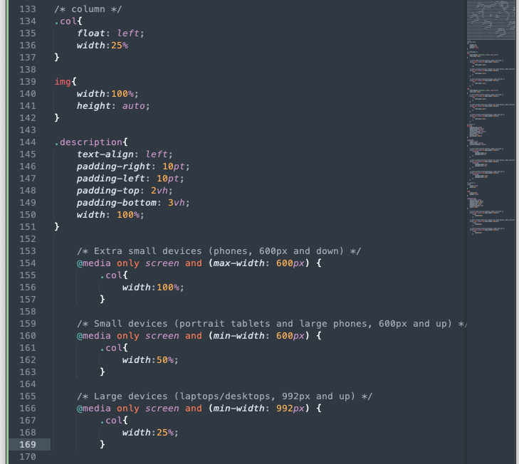
Set up the "content" class and the grid with class "col". The width of the grid should be (100/#-of-total-column)%
.content{
float: left;
align-items: center;
justify-content: center;
}
.col{
float: left;
width:25%
}
Set up the Photo and Description Formatting
img{
width:100%;
height: auto;
}
.description{
text-align: left;
padding-right: 10pt;
padding-left: 10pt;
padding-top: 2vh;
padding-bottom: 3vh;
width: 100%;
}
6. Set up the Media Query
Media query is a CSS technique introduced in CSS3.It uses the @media rule to include a block of CSS properties only if a certain condition is true.
You can use this template:
/* Extra small devices (phones, 600px and down) */
@media only screen and (max-width: 600px) {}
/* Small devices (portrait tablets and large phones, 600px and up) */
@media only screen and (min-width: 600px) {}
/* Large devices (laptops/desktops, 992px and up) */
@media only screen and (min-width: 992px) {}
Use the media query to set up the break points of any content that need to be responsive to the users' devices' screen size.
Below is my example for the width of the photo grid's columns:
/* Extra small devices (phones, 600px and down) */
@media only screen and (max-width: 600px) {
.col{
width:100%;
}
/* Small devices (portrait tablets and large phones, 600px and up) */
@media only screen and (min-width: 600px) {
.col{
width:50%;
}
/* Large devices (laptops/desktops, 992px and up) */
@media only screen and (min-width: 992px) {
col{
width:25%;
}
Apply this to the typography as well to improve the legibility of the body copy. Your CSS should look like this or something similar:
