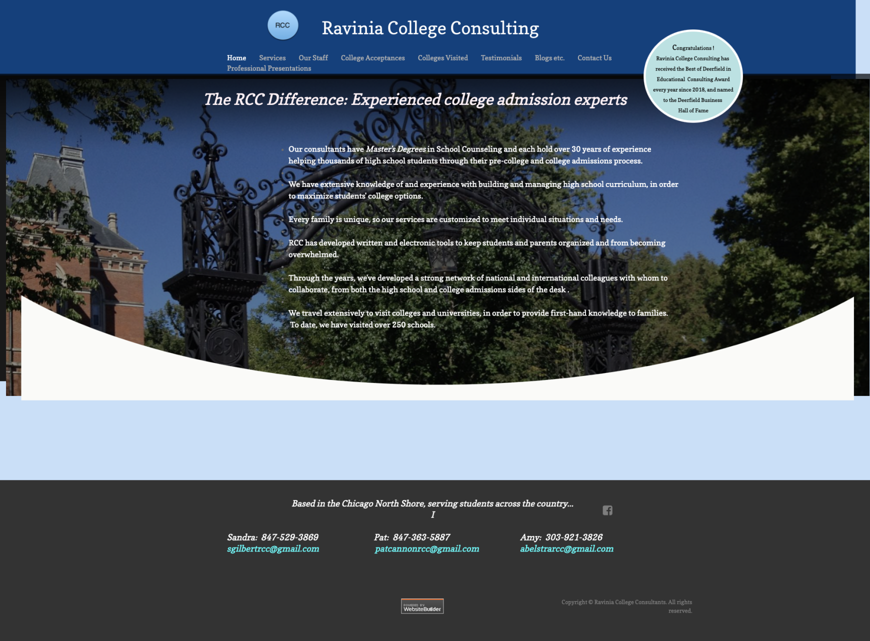
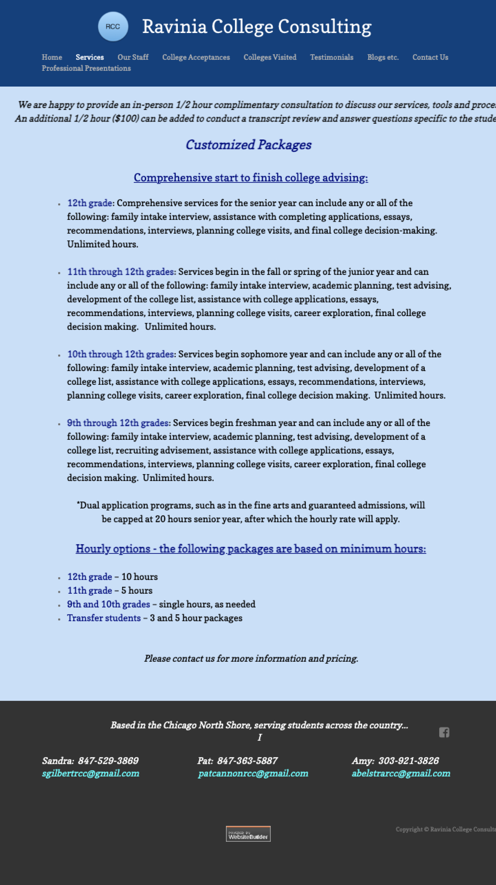
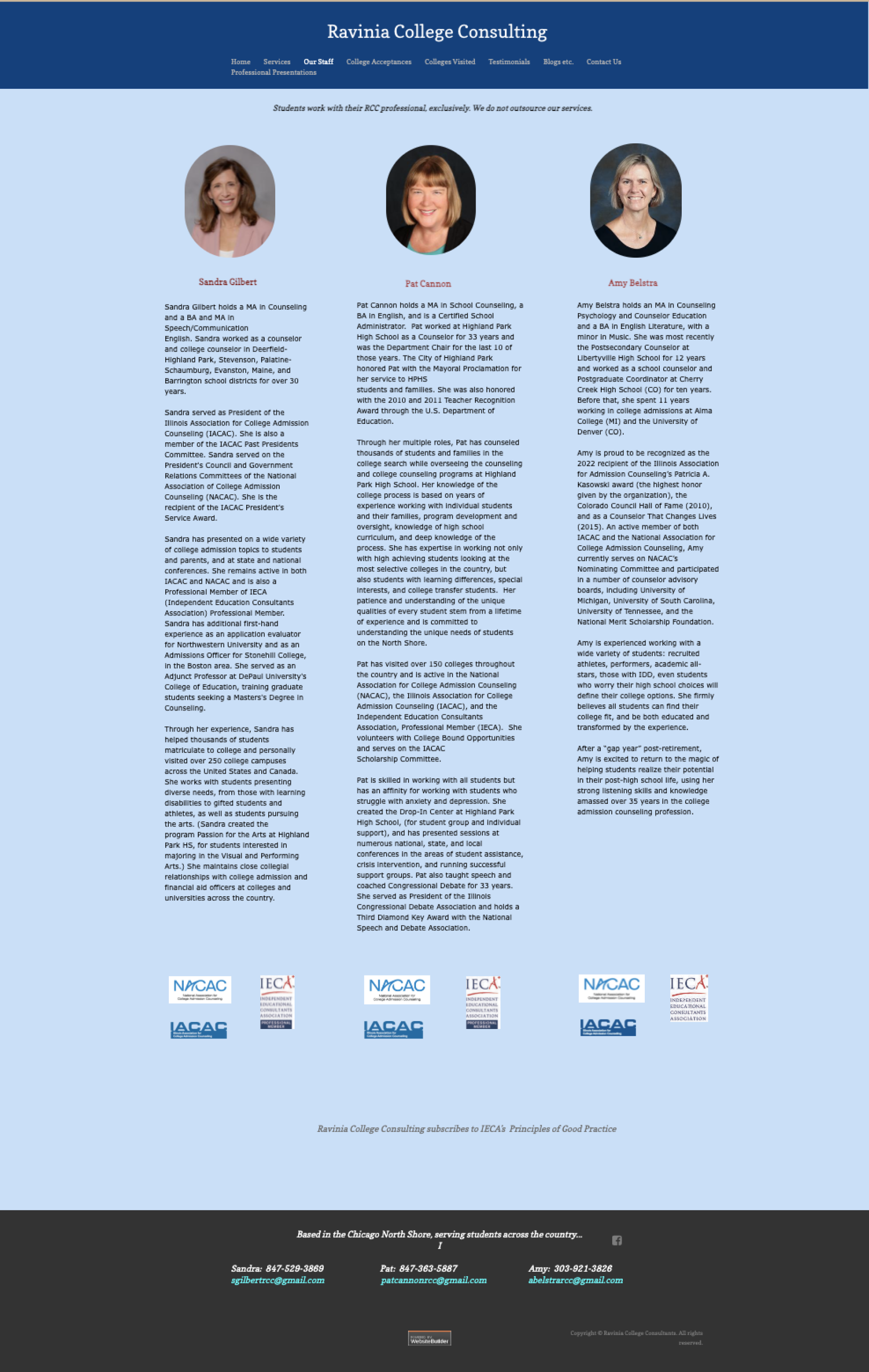
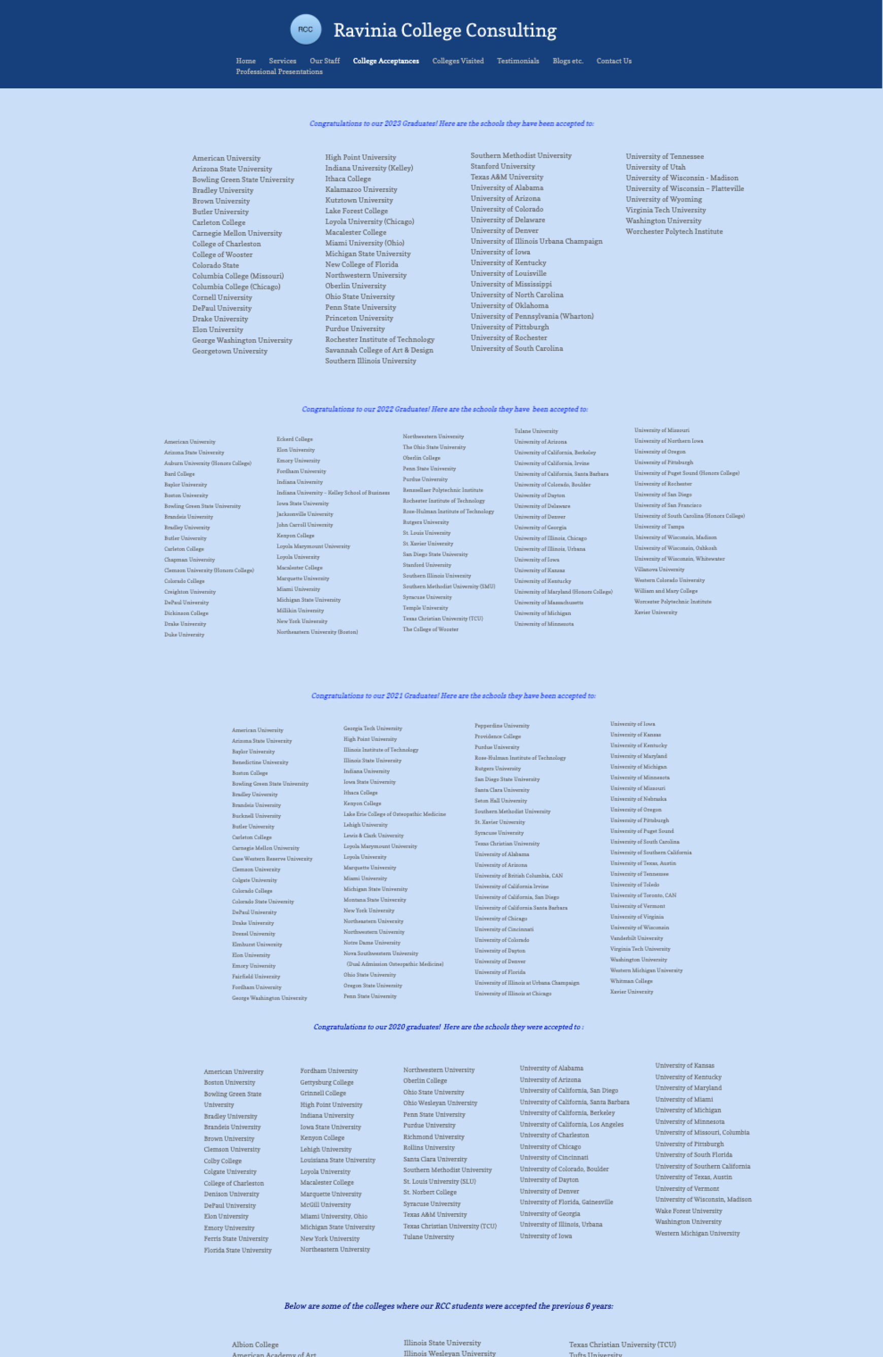
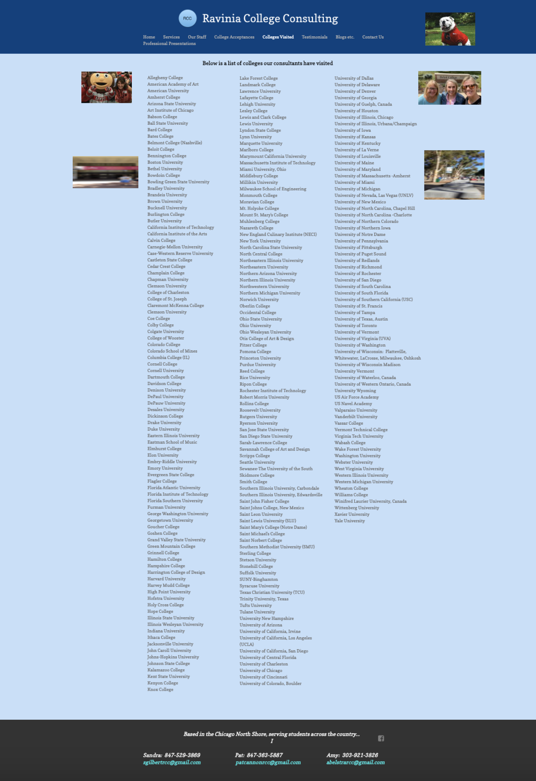
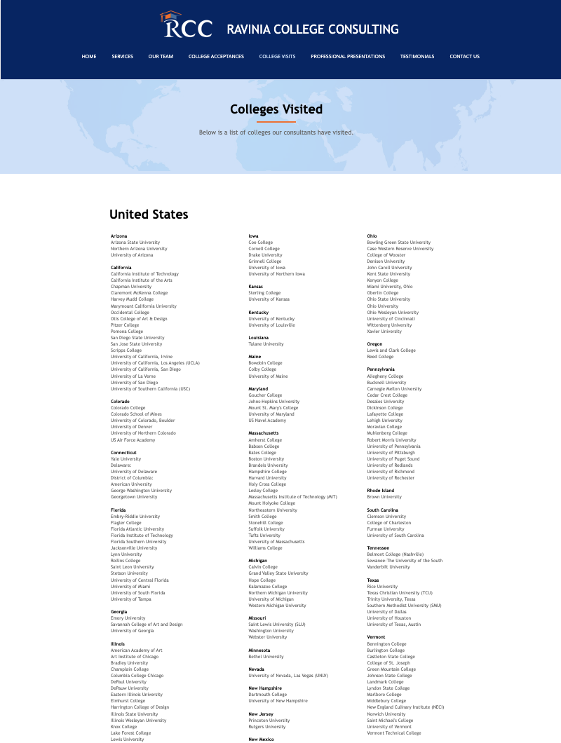
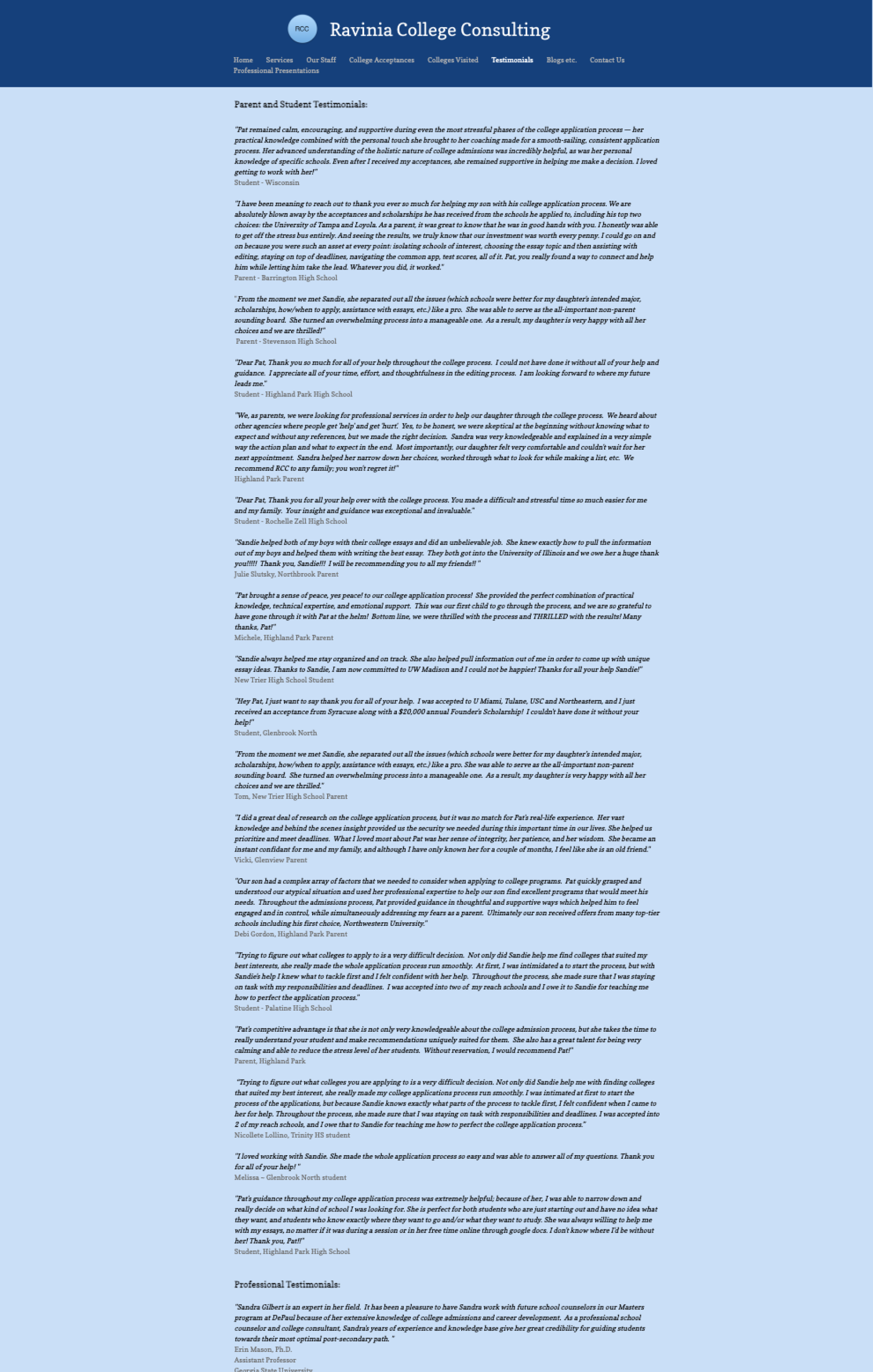
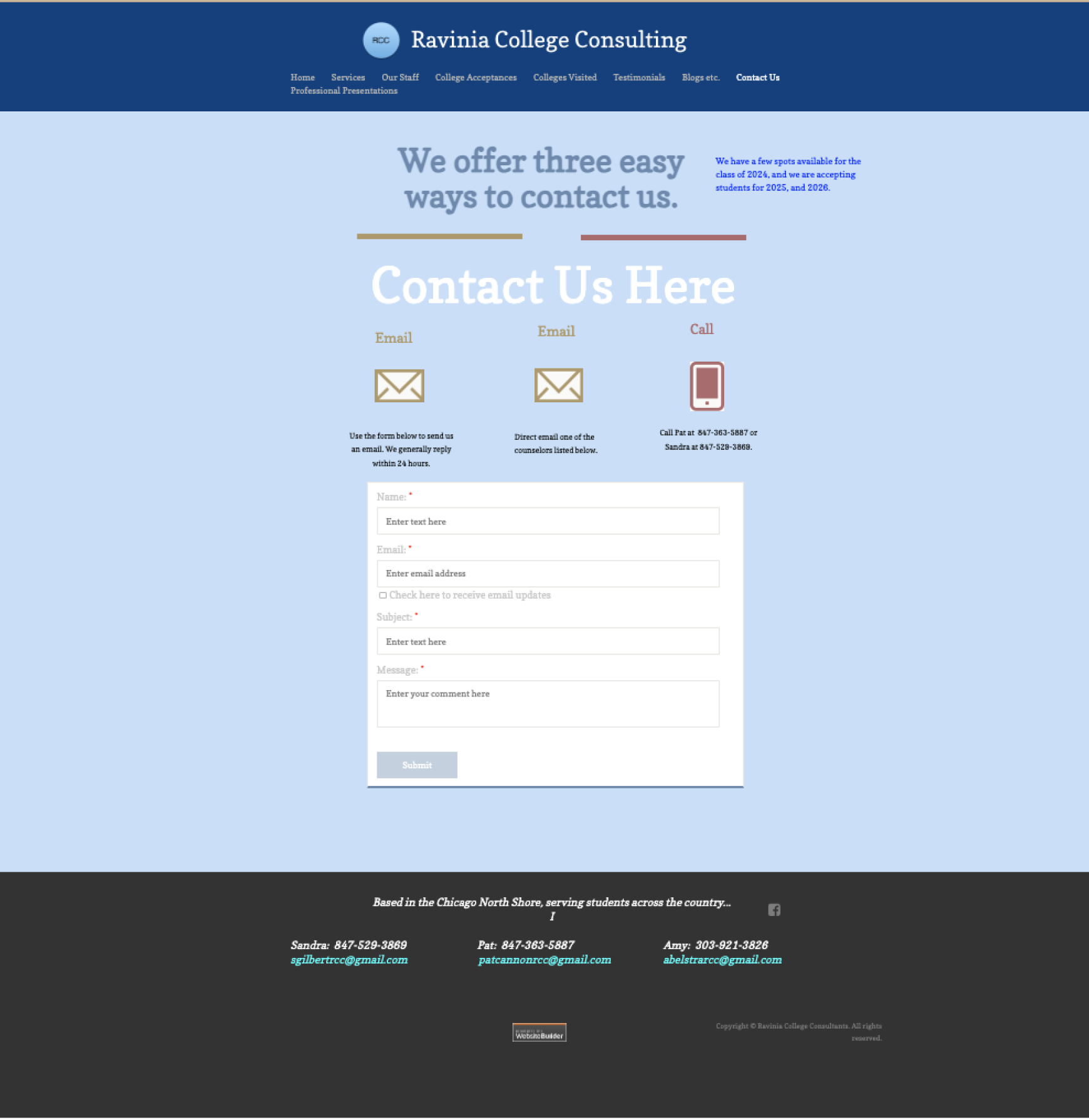
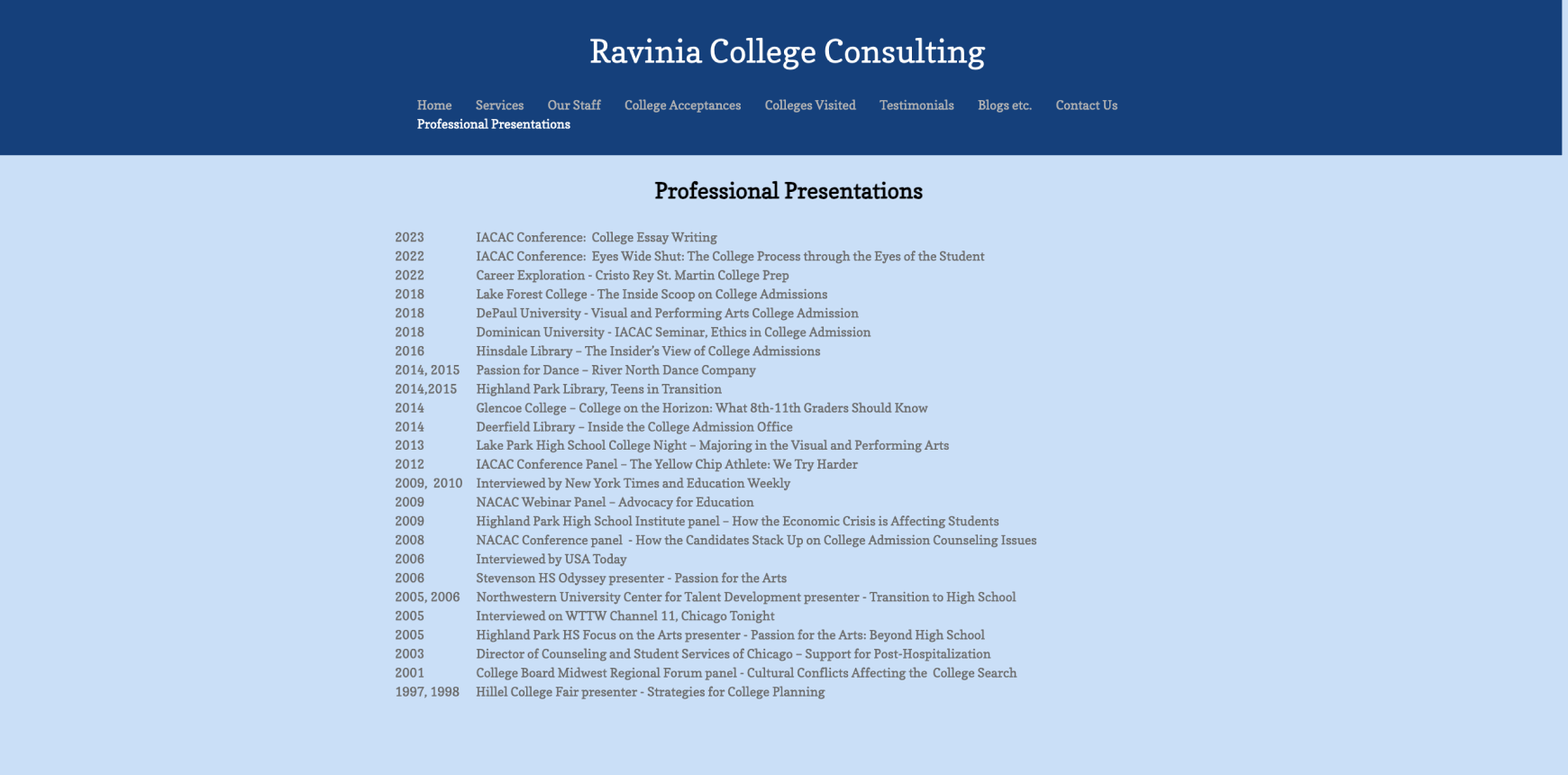
Before

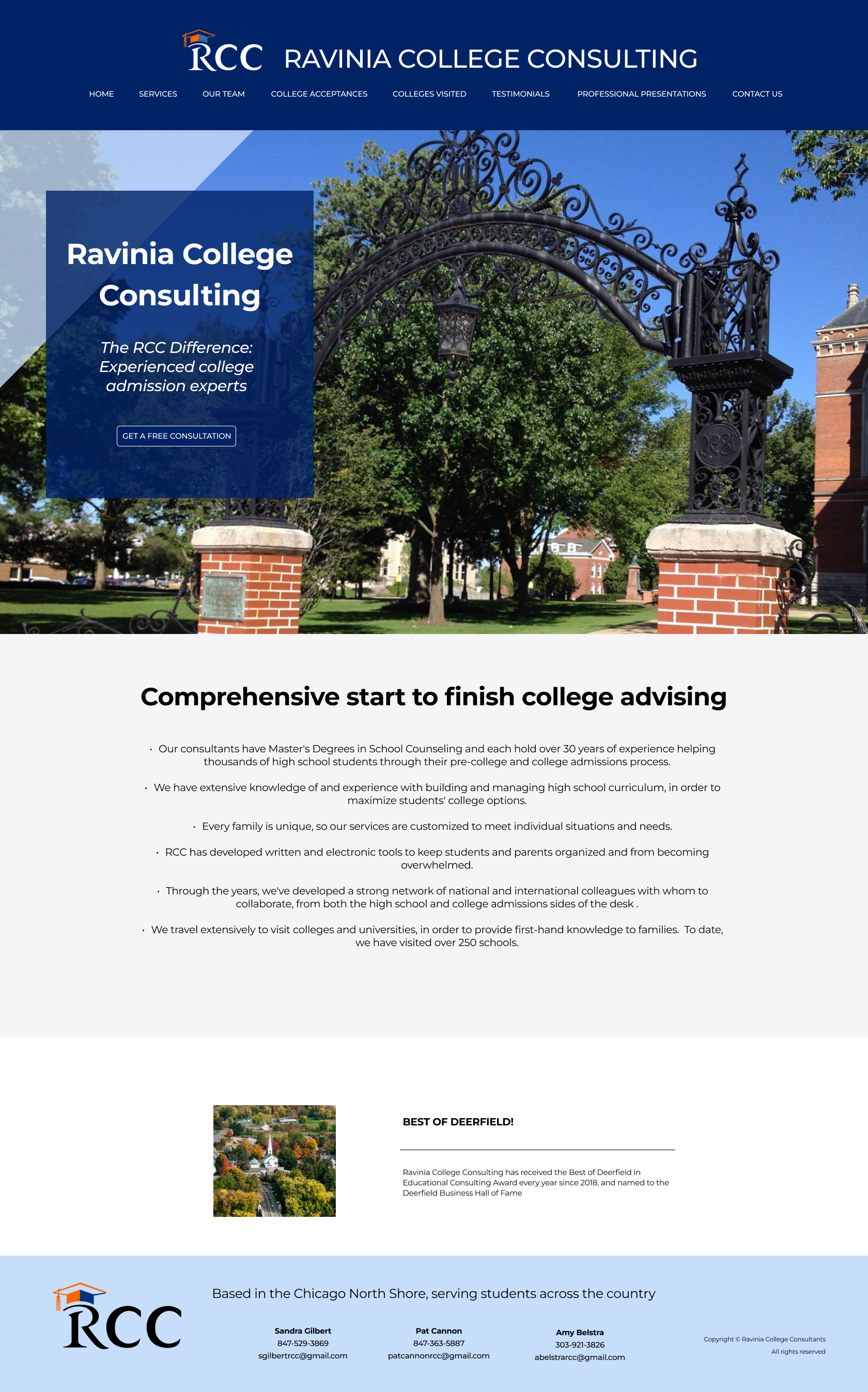
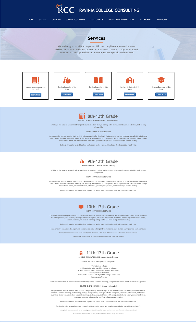
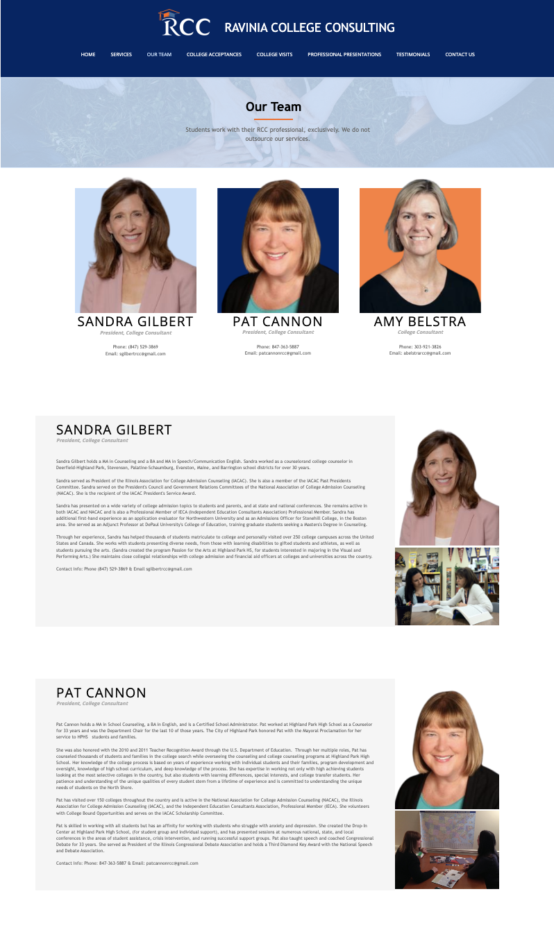
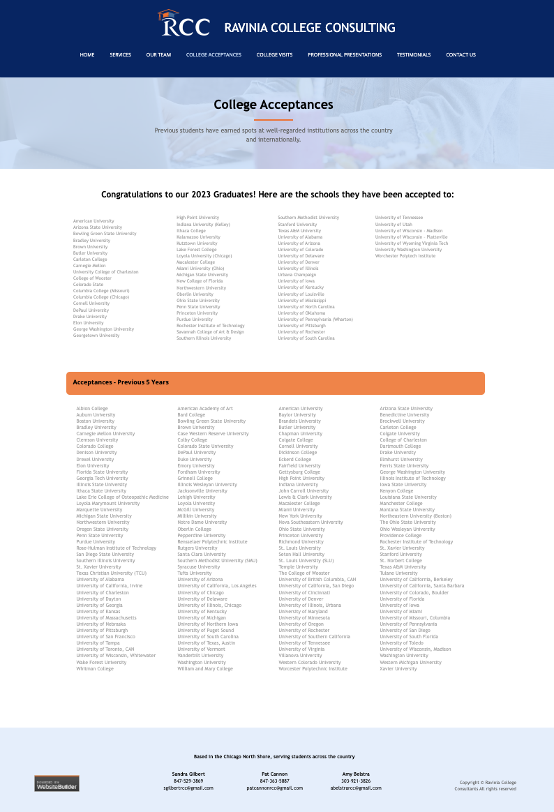
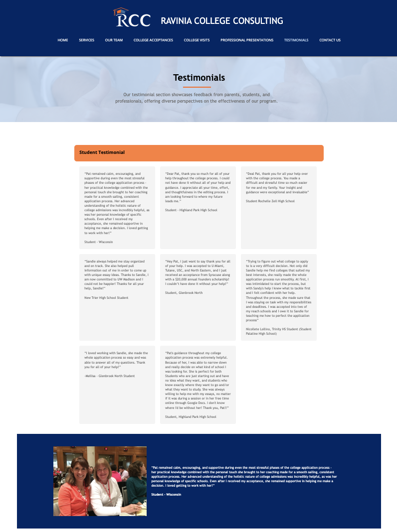
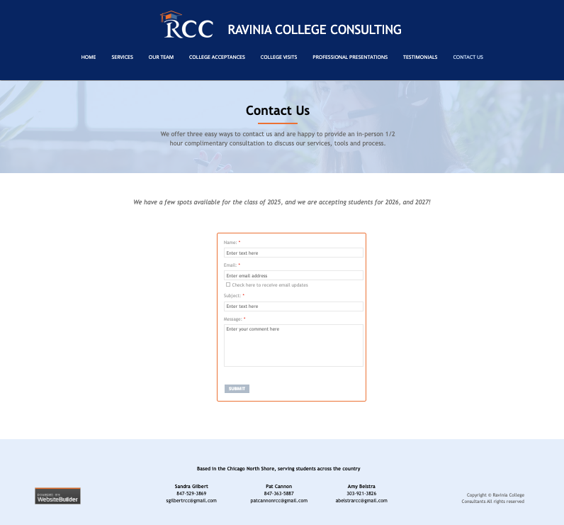
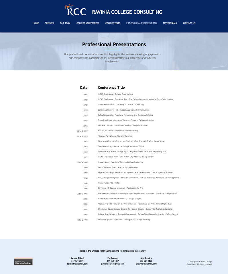
After


The Ravinia College Consultant website faced significant usability issues, including poor mobile compatibility, overwhelming color schemes, and disorganized content. To resolve these, the redesign introduced responsive design for better mobile access, established a cohesive color scheme, and reorganized key sections like the navigation bar and services section. The homepage was also revamped to improve readability and highlight essential information. Additionally, long text lists were segmented, and testimonials were categorized for easier navigation. These changes have made the website more accessible, visually consistent, and user-friendly.
Role in Team: Lead Web Developer, Lead Designer, & Project Manager
Duration: 10 Months
Tools: Figma, GoDaddy, Illustrator, HTML, CSS, & Javascript
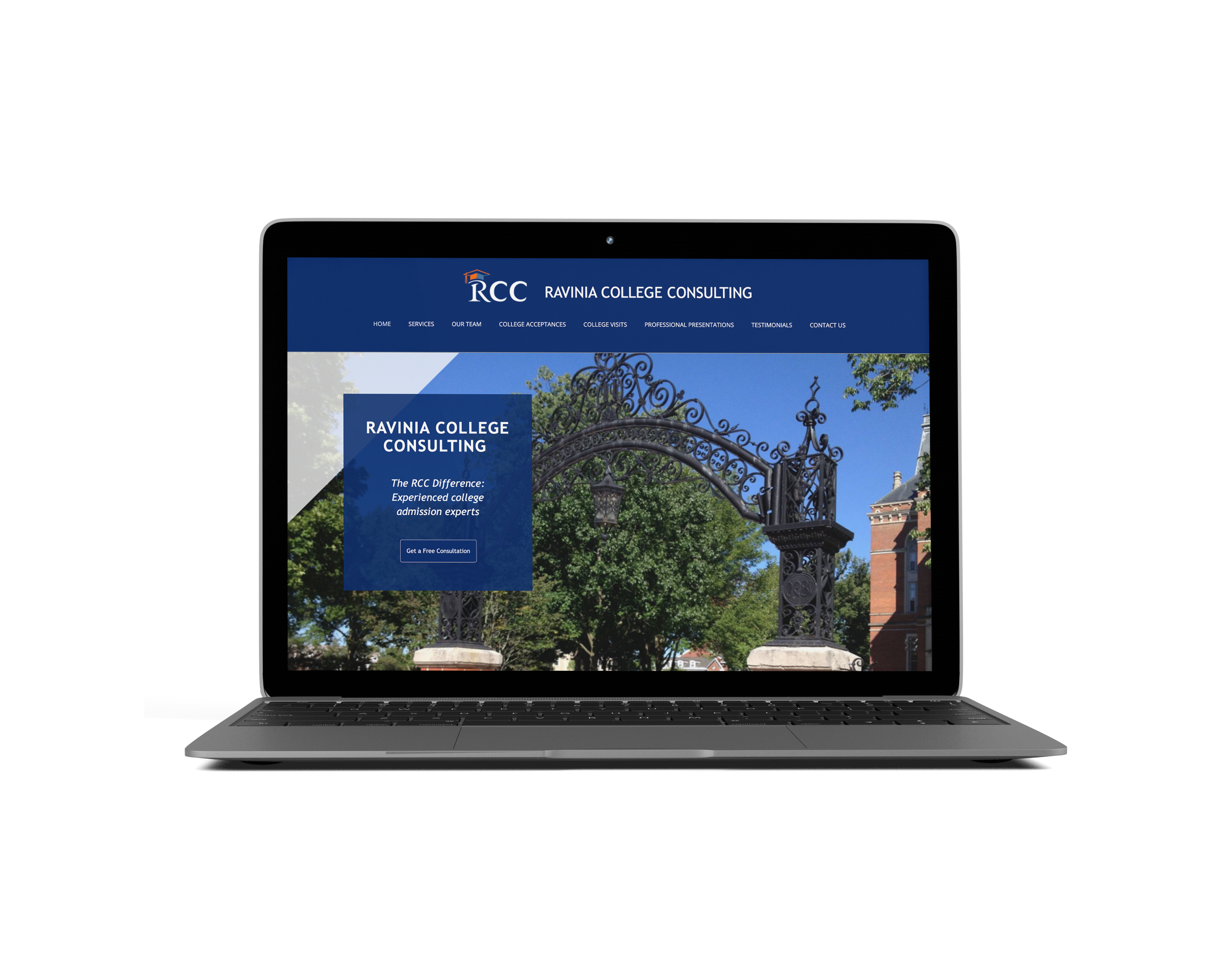
Problem - The site was not compatible with mobile devices, and the blue header with an all-blue body was visually overwhelming
Solution - Implemented responsive design principles to ensure layout adjusts smoothly on mobile devices. Established a consistent color scheme with main colors #002366 (dark blue), #C6DEFA (light blue), and accent color #F24E1E (orange). Minimized use of random colors to create a cohesive visual identity.
